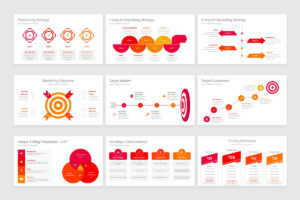
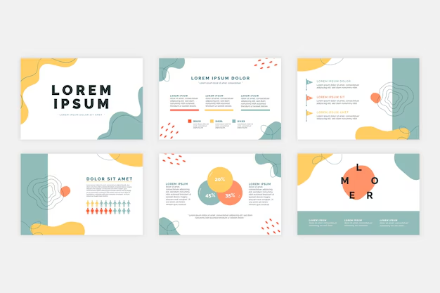
In today’s fast-paced world, presentations have become a central tool for communication in business, education, and beyond. Whether you’re pitching a product, sharing research findings, or teaching a class, your slides can either elevate your message or dilute its impact. The design of your PowerPoint templates plays a significant role in how your audience perceives and retains the information you present.
A well-designed slide deck doesn’t just look good—it tells a story, enhances understanding, and keeps the audience engaged. But designing an effective presentation template is not just about choosing pretty fonts or flashy transitions. It’s about aligning visual elements with purpose and clarity.
Here are several key tips to help you design PowerPoint templates that truly engage and inspire your audience.
1. Begin with Purpose in Mind
Before diving into design elements, consider the goal of your presentation. Are you informing, persuading, teaching, or inspiring? The tone of your template should reflect this purpose. For instance, a sales pitch might benefit from bold visuals and confident colors, while a research presentation may require a more minimalist and data-focused layout.
Your audience is equally important. Executives, clients, students, or conference attendees all bring different expectations and preferences. Knowing your audience helps you determine the right level of complexity, formality, and visual interest.
2. Keep It Simple and Consistent
Simplicity is key to engagement. Overly cluttered slides can overwhelm the viewer and distract from your message. Stick to a clean layout with plenty of white space to allow your content to breathe.
Consistency throughout your slides builds visual coherence. Use a unified color palette, font pairing, and formatting rules. This doesn’t mean every slide has to look the same—but they should feel like part of the same family. A consistent design reduces cognitive load and allows the audience to focus on your message, not your design choices.
3. Limit Your Fonts and Colors
Too many fonts and colors can make a presentation look chaotic. Choose no more than two complementary fonts—typically one for headings and another for body text. Sans-serif fonts such as Helvetica, Arial, or Calibri are generally easier to read on screens.
For colors, pick a base color and two or three accent colors. Use tools like Adobe Color or Coolors to find harmonious palettes. High contrast between text and background ensures readability. Avoid using bright colors like neon yellow or cyan for text, especially on white backgrounds.
4. Use High-Quality Visuals
Visuals are powerful tools for communication. Relevant images, graphs, and icons can help explain complex ideas and keep the audience interested. However, visuals must be used thoughtfully.
Avoid low-resolution images or generic clip art. Use professional-quality photos and illustrations that align with your message. Websites like Unsplash, Pexels, or Flaticon offer a wide selection of free high-quality assets.
When using graphs or charts, simplify the data to highlight key insights. Don’t include every data point—only what supports your narrative. Use labels and color-coding to make charts intuitive and easily digestible.
5. Design with Accessibility in Mind
A truly inspiring presentation reaches everyone in the audience. Designing with accessibility in mind ensures that your content is inclusive to all, including those with visual impairments or learning differences.
Use sufficient contrast between text and background. Avoid red-green combinations, which can be difficult for colorblind viewers. Use large, legible fonts—minimum 24-point for body text.
When possible, supplement visuals with descriptive text or narration. Structure your content logically, with clear headings and bullet points to guide the viewer.
6. Master the Use of Negative Space
Negative space, or whitespace, is the empty space between elements in your design. It helps reduce visual clutter and guides the viewer’s eye to the most important content.
Rather than filling every inch of your slide, embrace minimalism. A single image with a concise line of text can be more powerful than a dense block of bullet points. Negative space creates a sense of calm and professionalism, and it subtly communicates confidence in your message.

7. Use Slide Layouts Strategically
Slide layouts are more than placeholders—they’re tools to guide your storytelling. Create a few master layouts for different content types: title slides, section dividers, image-heavy slides, data-centric slides, and text slides.
Keep these layouts flexible but intentional. Reserve the most prominent visual positions for your most important information. Use grids to align content and maintain visual balance. Templates that employ thoughtful layout design can dramatically improve both the appearance and clarity of your message.
8. Animate with Intention
Animation can enhance engagement when used purposefully. Transitions and entrance effects can help control the flow of information, direct attention, and add visual interest.
However, overusing animation is one of the quickest ways to lose credibility. Stick to simple, subtle animations—like fades or wipes—and avoid flashy or distracting effects like spinning text or bouncing images.
Use animations to guide the audience’s focus. For example, reveal bullet points one at a time to match your spoken delivery. But always ask yourself: does the animation add clarity, or just visual noise?
9. Prioritize Mobile and Remote Viewers
With the rise of remote work and virtual presentations, your slides may be viewed on anything from a smartphone to a large monitor. Make sure your designs scale well across different screen sizes.
Use large text and clear visuals. Avoid cramming too much information onto one slide. Test your presentation on different devices to check for legibility and design consistency. A great design considers how and where it will be seen.
10. Use a Custom PowerPoint Template
While built-in themes are convenient, they often lack uniqueness and polish. A custom PowerPoint template allows you to tailor every design element to match your brand, message, and audience.
A custom template also saves time in the long run. Once you’ve created consistent layouts, fonts, colors, and placeholders, you can quickly build future presentations without reinventing the wheel.
Designing your own template also provides an opportunity to reinforce brand identity through logos, colors, and imagery. This is especially important for businesses and professionals who want to leave a lasting impression.
11. Build in Flexibility
Good design adapts to different types of content. Your template should allow for variation—images one slide, bullet points the next, charts after that—while still maintaining a consistent look and feel.
Include a variety of layout options and content blocks. Test the template with real content to ensure it remains legible and appealing across use cases. Anticipate common scenarios and create design solutions for them within the template.
12. Focus on the Story, Not Just the Slides
Even the most beautiful slides are meaningless without a compelling narrative. Use your design choices to support your story arc—from problem to solution, from question to answer, from challenge to triumph.
Each slide should have a purpose and contribute to the overall flow. Don’t add content just to fill space. Every image, chart, or word should serve your message.
Consider using a structure like “What, So What, Now What”: What is the issue or idea? Why does it matter? What should we do about it? Your visuals and layout should reflect this logical progression.
13. Test and Gather Feedback
No design is perfect on the first try. Once your template is complete, test it in real-world conditions. Present it to a small group, get feedback, and refine accordingly.
Pay attention to how audiences respond. Are they following your message? Are they distracted by any design elements? Is your content accessible and engaging?
A willingness to revise and improve is essential. The best templates evolve over time based on feedback and changing needs.
14. Use Visual Hierarchy Effectively
Visual hierarchy refers to the arrangement of elements in a way that implies importance. This can be achieved through size, color, placement, or contrast.
For example, your slide title should be the largest text element, with key points slightly smaller, and explanatory text smaller still. Use bold or color selectively to highlight critical information.
Visual hierarchy helps guide the viewer’s eye and ensures that the most important content is noticed first. It’s a subtle but powerful way to direct attention.
15. Inspire Through Emotion and Connection
Ultimately, a great presentation isn’t just seen—it’s felt. To truly inspire, design your slides in a way that supports emotional resonance.
Use imagery that reflects the human side of your topic. Choose stories and examples that your audience can relate to. Combine clear, confident visuals with your authentic voice.
Inspiration is not just about making people feel good. It’s about connecting with them on a deeper level and moving them to action. Your PowerPoint template is a tool for building that connection.
Conclusion
Designing a PowerPoint template that engages and inspires is both an art and a science. It requires attention to detail, empathy for your audience, and a clear understanding of your message. While the principles outlined above serve as a guide, the most effective presentations come from thoughtful experimentation and refinement.
Don’t just think of slides as decoration. Think of them as your visual partner in communication. When crafted with care, your template can transform a good presentation into a memorable experience—one that informs, motivates, and resonates long after the projector turns off.


